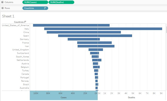
In this post, we will look into the use of Tableau to create Butterfly charts.
These charts are used much in everyday office life when comparing two items against one dimension i.e. actual vs budget etc.
Although the message which this type of charting conveys can also be done through typical charting techniques like Bar or Pie Charts, but more recently we have seen the demand of more user friendly and sophisticated charting techniques - and butterfly charting is one of them.
We will use the recent COVID-19 Pandemic data (as of 28th March 2020) to illustrate this chart.
DATABASE
We have the data in below format in xls. which is imported into Tableau Desktop
STEPS
STEP NO.1
Once done, data shall look like below
STEP NO. 2
Right click on the X-Axis of the chart and then Edit Axis. Below window shall appear. Check on the reversed check-box.
The chart shall appear as below
STEP NO. 3
Go to Analysis tab and click on Create Calculate field.
Name the field "NIL" with Zero Value.
Drag the above defined measure "NIL" in between "Cases" and "deaths" in columns bar.
The chart shall look as below now
STEP NO. 4
Our basics of the chart is ready now. In this step, we will do the formatting. You can have different formatting options. In this case, i'm going ahead with below features.
a) Remove the X-asix and Y-axis Headers. This can done through clicking right on the related axis and turning down the option.
b) select the Sum column and drag the countries dimension onto label properties.
c) go to format tab and click on Lines. Remove the Grid, axis and Axis tick lines in SHEETs and remove grid lines from COLUMNS.
d) Select the NIL measures and change the text property from automatic to TEXT.
e) now change the colours of the both bars to look interactive.
THE FINAL CHART IS READY - HAVE A LOOK !
Hope you like the post. Hit like and let us know of your feedback.


Comments
Post a Comment